Maps in Power BI
What is Power BI?
Power BI is a collection of software services, apps, and connectors that work together to turn your unrelated sources of data into interactive visuals.
The parts of Power BI
Power BI consists of three main basics:
- Power BI Desktop: Desktop application for Windows users.
- Power BI service: an online service.
- Power BI mobile app: for Windows, iOS, and Android devices.
Data sources
Excel, PDF File, Share point, Web, SQL Server, Access, SQL Server Analysis Services, Oracle, IBM DB2, MySQL, PostgreSQL, Sybase, Teradata, and SAP HANA.
Power BI Maps
Power BI integrates with Bing Maps to provide default map coordinates so you can create maps.
There are 4 types of core map visuals:
Map (Basic)
When to use a basic map?
This type of Map visual displays points that can be scaled as area bubbles if desired, This map is used for basic presentations like showing the size of the population, total sales, etc…
How to add a basic map?
From the report view, choose Map Visualization.
Add the fields:
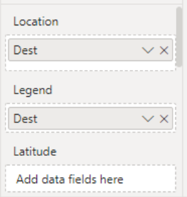
On the Location, drop Country, State, and City fields. You can add the latitude and longitude fields as well, On the Size, drop the Sales.
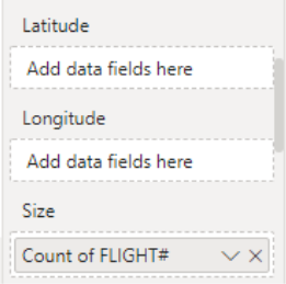
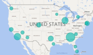
This map presents the number of flights at each airport.

Filled Map
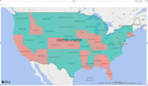
When to use a filled map?
This map is used to display quantitative information on a map, to show spatial patterns and relationships, when your data is standardized when working with socioeconomic data, and when defined regions are important or to get an overview of the distribution across geographic locations.
Create a filled map:
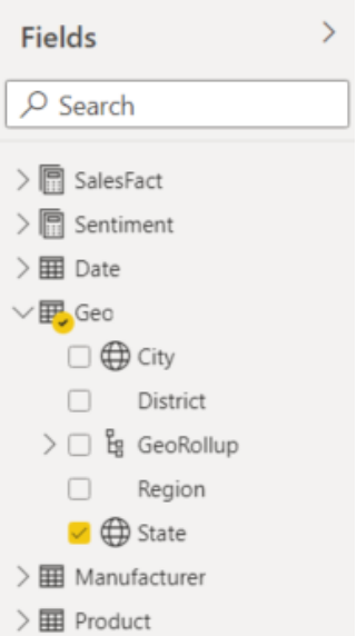
From the Fields pane, select the Geo > State field.
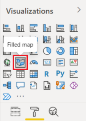
Choose filed map form visuals
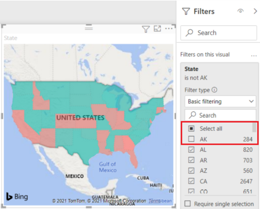
Filter the map to display only the continental United States.
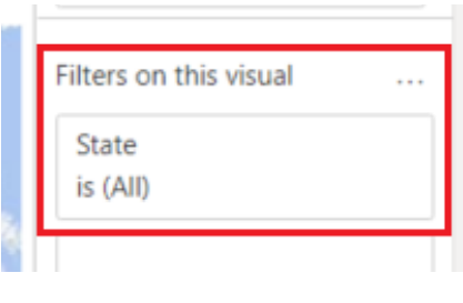
Filter the map to display only the continental United States.
ArcGIS Maps
What is a GIS map used for?
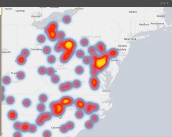
This kind of map is used when an organization already has geo data in ArcGIS that they want to display. GIS maps can be used to show information about numbers and density. For example, GIS can show how many doctors there are in a neighborhood compared with the area’s population. With GIS technology, researchers can also look at change over time.
Create an ArcGIS:
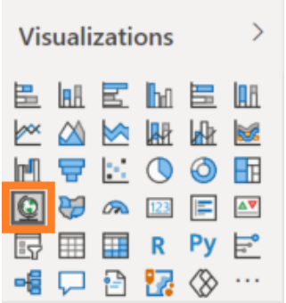
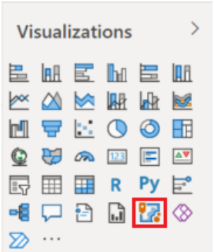
Select the ArcGIS for Power BI icon from the Visualizations pane.
From the Fields, drag a data field to the Location field or drag Latitude and/or Longitude.
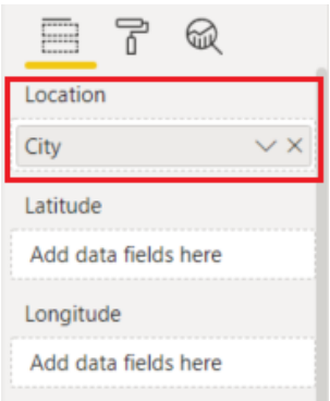
From the Fields pane, drag a measure to the Size bucket to adjust how the data is shown. In this example, we’re using Sales > Last Year Sales.
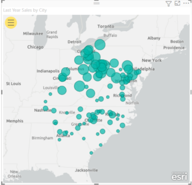
From the Fields pane, drag a measure to the Size bucket to adjust how the data is shown. In this example, we’re using Sales > Last Year Sales.
Shape Map (preview)
What is a GIS map used for?
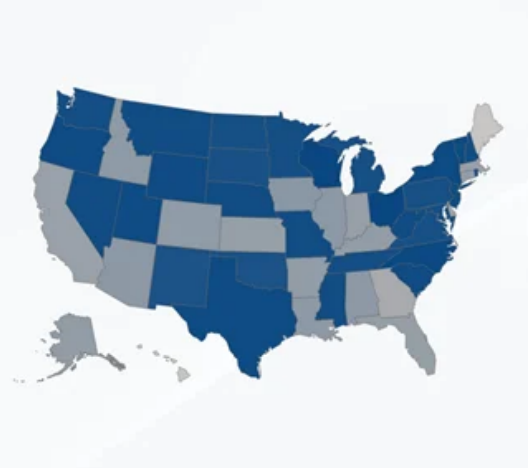
Typically, Shape Maps are used to illustrate the variation of a variable across a geographic area. Unlike the Map visual, Shape map doesn’t show precise geographical locations of data points on a map. Instead, its main purpose is to compare regions on a map by coloring them differently.
Another use is to create custom shape maps for things like buildings, seating arrangements, or custom geographic regions.
Creating Shape Maps:
From the report view choose shape Map visualization.
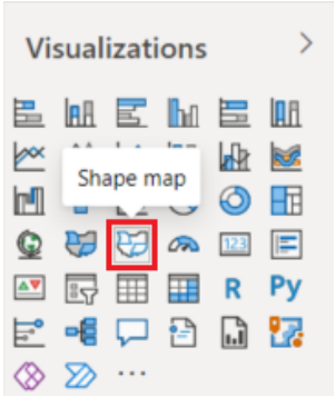
In the Fields pane, drag a data field that has geography names (or abbreviations) onto the Location bucket, and a data measure field into the Color saturation bucket.
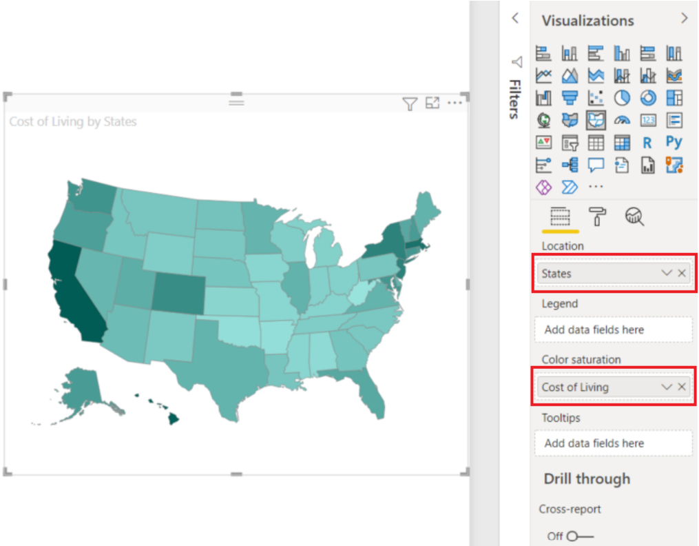
As well as you can use custom visual maps, here is an example :
Flow map custom visual:
Have you ever worked with a dataset containing airplanes or the movement of people between countries and you want to visualize them?
A flow map is one of the custom visuals that you can use for presenting a flow of things in power bi. created by Weiwei Cui, The aim of this visual is to depict the movements of objects among geo-locations.
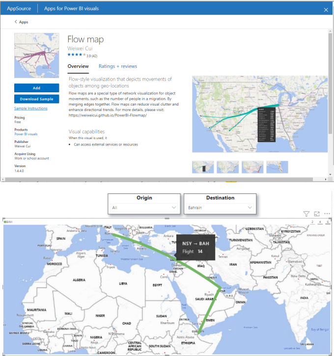
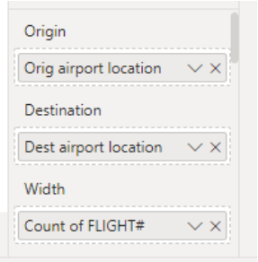
Main fields in the visual:
- Origin: Origin location
- Destination: Destination
- location Width: The width of the line between two countries will be based on this field
- Color: Color of the line will be based on origin or destination Origin and destination
- latitude and longitude: for more specific locations.
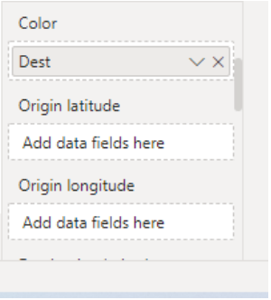
- Origin and destination names: this will be shown in the tooltip like this: Origin -> Destination
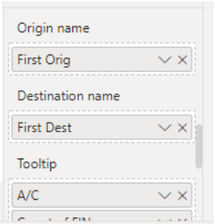
Preparing Your Dataset:
We will be using a dataset for airplanes.
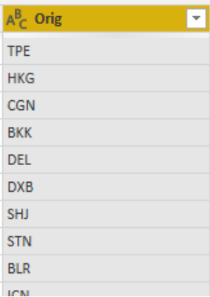
As mentioned earlier you have two options for specifying locations, either by their names or latitude and longitude.
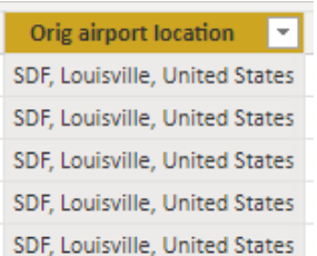
First, make sure that your location data is correctly geo-coded, If your place column is a non popular place or code , you better have to use the latitude and longitude or combine the place with the city and country columns using DAX like following:

The column will be look like this:
Formatting visual:
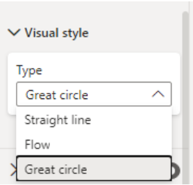
There are lots of formatting options on a Flow map, including:
- Visual style
- Line color
- Line width
- Bubbles
- Map control (choosing the color and the language for the map)

Conclusion
There are lots of ways to visualize your geospatial data in Power BI , including the main 4 visuals: Basis , Filled, ArcGIS Maps and Shape Map , As well as the custom visual maps that has been discussed in this article.
